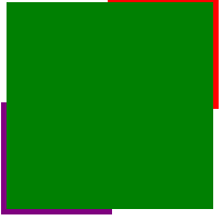
效果如下
1
2
| clip 属性剪裁绝对定位元素。
rect (top, right, bottom, left)
|
四个参数分别设置可显示矩形上 下 左 右 的像素值。
1
2
3
| <div class="bruce flex-ct-x">
<div class="snakelike-border"></div>
</div>
|
1
2
3
4
5
6
7
8
9
10
11
12
13
14
15
16
17
18
19
20
21
22
23
24
25
26
27
28
29
30
31
32
33
34
35
36
37
38
39
40
41
42
43
| $green: green;
$red: red;
$purple: purple;
.snakelike-border {
position: relative;
width: 190px;
height: 190px;
background-color: $green;
&::before,
&::after {
position: absolute;
left: -5px;
right: -5px;
top: -5px;
bottom: -5px;
border: 5px solid;
content: "";
animation: move 5s linear infinite;
-webkit-animation: move 5s linear infinite;
}
&::before {
border-color: $red;
}
&::after {
border-color: $purple;
animation-delay: -2.5s;
}
}
@keyframes move {
0%,
100% {
clip: rect(0 200px 5px 0);
}
25% {
clip: rect(0 200px 200px 195px);
}
50% {
clip: rect(195px 200px 200px 0);
}
75% {
clip: rect(0 5px 200px 0);
}
}
|
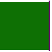
单个测试

1
| clip: rect(0 200px 5px 0);
|
1
| clip: rect(0 200px 200px 195px);
|