css3-anmation-loading
1 | animation-name 规定需要绑定到选择器的 keyframe 名称。 |
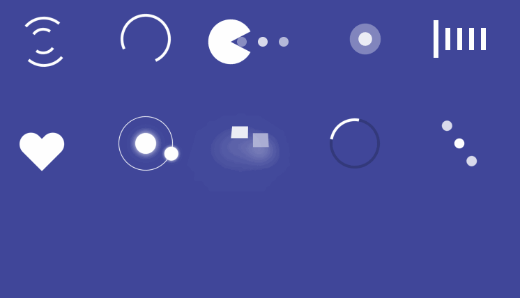
公用样式:1
2
3
4
5
6
7
8
9
10
11
12body{
background: #40479a;
}
.demo{
width: 120px;
height: 120px;
margin: 15px;
float: left;
&:hover {
border: 1px dashed #fff;
}
}
1.1
2
3
4
5
6
7
8
9
10
11
12
13
14
15
16
17
18
19
20
21
22
23
24
25
26
27
28
29
30
31
32
33
34
35
36
37
38
39
40
41
42
43
44
45
46
47
48
49
50
51
52
53
54
55
56
57
58
59
60<div class="demo demo_1">
<div class="demo_1_box">
<div class="redius_1_1"></div>
<div class="redius_1_2"></div>
</div>
</div>
@keyframes rotate-redius_1
{
0% { transform:rotate(30deg); }
50% { transform:rotate(210deg); }
100%{ transform:rotate(-30deg); }
}
@keyframes rotate-redius_2
{
0% {
transform:rotate(-30deg);
}
50% {
transform:rotate(150deg);
}
100%{
transform:rotate(-90deg);
}
}
.demo_1{
.demo_1_box{
position: relative;
top: 28px;
left: 28px;
}
.redius_1_1{
width: 64px;
height: 64px;
position: absolute;
top: 0;
left: 0;
border: 4px solid #fff;
border-radius: 100%;
border-bottom-color: transparent;
border-top-color: transparent;
transform:rotate(30deg);
animation: rotate-redius_1 2s linear infinite;
-webkit-animation: rotate-redius_1 2s linear infinite;
}
.redius_1_2{
width: 30px;
height: 30px;
position: absolute;
top: 16px;
left: 16px;
border: 4px solid #fff;
border-radius: 100%;
border-bottom-color: transparent;
border-top-color: transparent;
border-radius: 100%;
transform:rotate(-30deg);
animation: rotate-redius_2 1s linear infinite;
-webkit-animation: rotate-redius_2 1s linear infinite;
}
}
2.1
2
3
4
5
6
7
8
9
10
11
12
13
14
15
16
17
18
19
20
21
22
23
24
25<div class="demo demo_2">
<div class="redius_2_1"></div>
</div>
@keyframes rotate_2 {
from {
transform:rotate(0deg);
}
to {
transform:rotate(360deg);
}
}
.demo_2{
display: flex;
justify-content: center;
align-items: center;
.redius_2_1{
width: 64px;
height: 64px;
border: 4px solid #fff;
border-radius: 100%;
border-right-color: transparent;
animation: rotate_2 1s linear infinite;
-webkit-animation: rotate_2 1s linear infinite;
}
}
3.1
2
3
4
5
6
7
8
9
10
11
12
13
14
15
16
17
18
19
20
21
22
23
24
25
26
27
28
29
30
31
32
33
34
35
36
37
38
39
40
41
42
43
44
45
46
47
48
49
50
51
52
53
54
55
56
57
58
59
60
61
62
63
64
65
66
67
68
69
70
71
72
73
74
75
76
77
78
79
80
81
82
83
84
85
86
87
88
89
90
91
92
93
94
95
96
97
98
99
100
101
102
103
104
105
106
107
108
109
110
111
112
113
114
115
116<div class="demo demo_3">
<div class="pacman_box">
<div class="pacman_1"></div>
<div class="pacman_2"></div>
<div class="circle_1"></div>
<div class="circle_2"></div>
<div class="circle_3"></div>
</div>
</div>
@keyframes rotate_3_1 {
from {
transform:rotate(45deg);
}
to {
transform:rotate(0deg);
}
}
@keyframes rotate_3_2 {
from {
transform:rotate(-45deg);
}
to {
transform:rotate(0deg);
}
}
@keyframes circle_1 {
from {
opacity: 1;
}
to {
opacity: 0;
}
}
@keyframes circle_2 {
from {
opacity: 0.5;
}
to {
opacity: 1;
}
}
@keyframes circle_3 {
from {
opacity: 0;
}
to {
opacity: 1;
}
}
.demo_3{
.pacman_box{
position: relative;
top: 32px;
.pacman_1{
width: 0;
height: 0;
border-radius:100%;
border: 32px solid #fff;
border-right-color: transparent;
position: absolute;
top: 0;
left: 0;
transform: rotate(45deg);
animation: rotate_3_1 0.5s linear infinite alternate;
-webkit-animation: rotate_3_1 0.5s linear infinite alternate;
}
.pacman_2{
width: 0;
height: 0;
border-radius:100%;
border: 32px solid #fff;
border-right-color: transparent;
position: absolute;
top: 0;
left: 0;
transform: rotate(-45deg);
animation: rotate_3_2 0.5s linear infinite alternate;
-webkit-animation: rotate_3_2 0.5s linear infinite alternate;
}
.circle_1{
width: 14px;
height: 14px;
background: #fff;
position: absolute;
top: 25px;
right: 65px;
border-radius: 100%;
opacity: 0;
animation: circle_1 0.5s linear infinite alternate;
-webkit-animation: circle_1 0.5s linear infinite alternate;
}
.circle_2{
width: 14px;
height: 14px;
background: #fff;
position: absolute;
top: 25px;
right: 35px;
border-radius: 100%;
opacity: 0.5;
animation: circle_2 0.5s linear infinite alternate;
-webkit-animation: circle_2 0.5s linear infinite alternate;
}
.circle_3{
width: 14px;
height: 14px;
background: #fff;
position: absolute;
top: 25px;
right: 5px;
border-radius: 100%;
animation: circle_3 0.5s linear infinite alternate;
-webkit-animation: circle_3 0.5s linear infinite alternate;
}
}
}
4.1
2
3
4
5
6
7
8
9
10
11
12
13
14
15
16
17
18
19
20
21
22
23
24
25
26
27
28
29
30
31
32
33
34
35
36
37
38
39
40
41
42
43
44
45
46
47
48
49
50
51
52
53
54
55
56
57
58
59
60
61
62
63
64
65
66
67
68
69
70
71
72
73
74
75<div class="demo demo_4">
<div class="demo4_circle_box">
<div class="demo4_circle_1"></div>
<div class="demo4_circle_2"></div>
</div>
</div>
@keyframes demo4_circle_1{
from {
transform:scale(1);
-webkit-transform:scale(1);
-moz-transform:scale(1);
-ms-transform:scale(1);
-o-transform:scale(1);
opacity: .5;
}
to {
transform:scale(0);
-webkit-transform:scale(0);
-moz-transform:scale(0);
-ms-transform:scale(0);
-o-transform:scale(0);
opacity: 0;
}
}
@keyframes demo4_circle_2{
from {
transform:scale(0);
-webkit-transform:scale(0);
-moz-transform:scale(0);
-ms-transform:scale(0);
-o-transform:scale(0);
opacity: 1;
}
to {
transform:scale(1);
-webkit-transform:scale(1);
-moz-transform:scale(1);
-ms-transform:scale(1);
-o-transform:scale(1);
opacity: .5;
}
}
.demo_4{
.demo4_circle_box{
position: relative;
top: 28px;
left: 28px;
.demo4_circle_1{
width: 64px;
height: 64px;
background: #fff;
border-radius:100%;
position: absolute;
left: 15px;
opacity: .5;
animation: demo4_circle_1 1s linear infinite alternate;
-webkit-animation: demo4_circle_1 1s linear infinite alternate;
}
.demo4_circle_2{
width: 64px;
height: 64px;
background: #fff;
border-radius:100%;
position: absolute;
left: 15px;
transform:scale(0);
-webkit-transform:scale(0);
-moz-transform:scale(0);
-ms-transform:scale(0);
-o-transform:scale(0);
animation: demo4_circle_2 1s linear infinite alternate;
-webkit-animation: demo4_circle_2 1s linear infinite alternate;
}
}
}
5.1
2
3
4
5
6
7
8
9
10
11
12
13
14
15
16
17
18
19
20
21
22
23
24
25
26
27
28
29
30
31
32
33
34
35
36
37
38
39
40
41
42
43
44
45
46
47
48
49
50
51
52
53
54
55
56
57
58
59
60
61
62
63
64
65
66
67
68
69
70
71<div class="demo demo_6">
<div class="demo6_circle_box">
<div class="demo6_son_1 demo6_son"></div>
<div class="demo6_son_2 demo6_son"></div>
<div class="demo6_son_3 demo6_son"></div>
<div class="demo6_son_4 demo6_son"></div>
<div class="demo6_son_5 demo6_son"></div>
</div>
</div>
@keyframes demo6_son{
0% {
transform: scaleY(1);
-webkit-transform: scaleY(1);
-moz-transform: scaleY(1);
-ms-transform: scaleY(1);
-o-transform: scaleY(1);
}
25% {
transform:scaleY(2);
-webkit-transform:scaleY(2);
-moz-transform:scaleY(2);
-ms-transform:scaleY(2);
-o-transform:scaleY(2);
}
50% {
transform:scaleY(1);
-webkit-transform:scaleY(1);
-moz-transform:scaleY(1);
-ms-transform:scaleY(1);
-o-transform:scaleY(1);
}
100% {
animation-play-state: paused;
}
}
.demo_6{
display: flex;
justify-content: center;
align-items: center;
.demo6_circle_box{
display: flex;
.demo6_son{
width: 7px;
height: 32px;
background: #fff;
&:not(:last-child) {
margin-right: 10px;
}
}
.demo6_son_1 {
animation: demo6_son infinite 2s ease-in-out;
-webkit-animation: demo6_son infinite 2s ease-in-out;
}
.demo6_son_2 {
animation: demo6_son infinite 2s ease-in-out .3s;
-webkit-animation: demo6_son infinite 2s ease-in-out .3s;
}
.demo6_son_3 {
animation: demo6_son infinite 2s ease-in-out .6s;
-webkit-animation: demo6_son infinite 2s ease-in-out .6s;
}
.demo6_son_4 {
animation: demo6_son infinite 2s ease-in-out .9s;
-webkit-animation: demo6_son infinite 2s ease-in-out .9s;
}
.demo6_son_5 {
animation: demo6_son infinite 2s ease-in-out 1.2s;
-webkit-animation: demo6_son infinite 2s ease-in-out 1.2s;
}
}
}
6.1
2
3
4
5
6
7
8
9
10
11
12
13
14
15
16
17
18
19
20
21
22
23
24
25
26
27
28
29
30
31
32
33
34
35
36
37
38
39
40
41
42
43
44
45
46
47
48
49
50
51
52
53
54
55
56
57
58
59
60
61
62
63
64
65
66
67<div class="demo demo_7">
<div class="demo7_circle_box"></div>
</div>
@keyframes demo_7{
from {
transform: scale(1);
-webkit-transform: scale(1);
-moz-transform: scale(1);
-ms-transform: scale(1);
-o-transform: scale(1);
}
to {
transform: scale(1.3);
-webkit-transform: scale(1.3);
-moz-transform: scale(1.3);
-ms-transform: scale(1.3);
-o-transform: scale(1.3);
}
}
.demo_7{
display: flex;
justify-content: center;
align-items: center;
.demo7_circle_box{
position: relative;
width: 40px;
height: 70px;
animation: demo_7 1s linear infinite alternate;
-webkit-animation: demo_7 1s linear infinite alternate;
&:before{
content: '';
width: 30px;
height: 50px;
display: block;
border-top-left-radius: 15px;
border-top-right-radius: 15px;
background: #fff;
transform: rotate(45deg);
-webkit-transform: rotate(45deg);
-moz-transform: rotate(45deg);
-ms-transform: rotate(45deg);
-o-transform: rotate(45deg);
transform-origin: 0 100%;
position: absolute;
top: 0;
left: 0;
}
&:after{
content: '';
width: 30px;
height: 50px;
display: block;
border-top-left-radius: 15px;
border-top-right-radius: 15px;
background: #fff;
transform: rotate(-45deg);
-webkit-transform: rotate(-45deg);
-moz-transform: rotate(-45deg);
-ms-transform: rotate(-45deg);
-o-transform: rotate(-45deg);
transform-origin: 100% 100%;
position: absolute;
top: 0;
left: 12px;
}
}
}
7.1
2
3
4
5
6
7
8
9
10
11
12
13
14
15
16
17
18
19
20
21
22
23
24
25
26
27
28
29
30
31
32
33
34
35
36
37
38
39
40
41
42
43
44
45
46
47
48
49
50
51
52
53
54
55
56
57
58
59
60<div class="demo demo_8">
<div class="demo8_circle_box"></div>
</div>
@keyframes demo_8 {
from {
transform: rotate(0deg);
-webkit-transform: rotate(0deg);
-moz-transform: rotate(0deg);
-ms-transform: rotate(0deg);
-o-transform: rotate(0deg);
}
to {
transform: rotate(360deg);
-webkit-transform: rotate(360deg);
-moz-transform: rotate(360deg);
-ms-transform: rotate(360deg);
-o-transform: rotate(360deg);
}
}
.demo_8{
display: flex;
justify-content: center;
align-items: center;
.demo8_circle_box{
position: relative;
width: 30px;
height: 30px;
padding: 23px;
border: 1px solid #fff;
border-radius: 100%;
-webkit-border-radius: 100%;
-moz-border-radius: 100%;
-ms-border-radius: 100%;
-o-border-radius: 100%;
animation: demo_8 3s linear infinite;
//linear//意思就是匀速的运动infinite//就是无限滚动的意思-webkit-animation:;
-webkit-animation: demo_8 3s linear infinite;
&:before{
content: '';
display: block;
width: 30px;
height: 30px;
background: #fff;
box-shadow: 0 0 10px #fff;
border-radius: 30px;
}
&:after{
content: '';
display: block;
width: 20px;
height: 20px;
background: #fff;
border-radius: 20px;
position: absolute;
top: 0;
left: 0;
box-shadow: 0 0 5px #fff;
}
}
}
8.1
2
3
4
5
6
7
8
9
10
11
12
13
14
15
16
17
18
19
20
21
22
23
24
25
26
27
28
29
30
31
32
33
34
35
36
37
38
39
40
41
42
43
44
45
46
47
48
49
50
51
52
53
54
55
56
57
58
59
60
61
62
63
64<div class="demo demo_9">
<div data-loader="jumping"></div>
</div>
@-webkit-keyframes jumping
{
0%
{
-webkit-transform: scale(1.0) translateY(0px) rotateX(0deg);
-ms-transform: scale(1.0) translateY(0px) rotateX(0deg);
-o-transform: scale(1.0) translateY(0px) rotateX(0deg);
transform: scale(1.0) translateY(0px) rotateX(0deg);
-webkit-box-shadow: 0 0 0 rgba(0,0,0,0);
box-shadow: 0 0 0 rgba(0,0,0,0);
}
100%
{
-webkit-transform: scale(1.2) translateY(-25px) rotateX(45deg);
-ms-transform: scale(1.2) translateY(-25px) rotateX(45deg);
-o-transform: scale(1.2) translateY(-25px) rotateX(45deg);
transform: scale(1.2) translateY(-25px) rotateX(45deg);
background: rgb(255,255,255);
-webkit-box-shadow: 0 25px 40px rgb(255,255,255);
box-shadow: 0 25px 40px rgb(255,255,255);
}
}
.demo_9{
display: flex;
justify-content: center;
align-items: center;
[data-loader='jumping']
{
position: relative;
width: 50px;
-webkit-perspective: 200px;
-moz-perspective: 200px;
-ms-perspective: 200px;
perspective: 200px;
}
[data-loader='jumping']:before,
[data-loader='jumping']:after
{
position: absolute;
width: 20px;
height: 20px;
content: '';
animation: jumping .5s infinite alternate;
background: rgba(0,0,0,0);
}
[data-loader='jumping']:before
{
left: 0;
}
[data-loader='jumping']:after
{
right: 0;
animation-delay: .15s;
}
}
9.1
2
3
4
5
6
7
8
9
10
11
12
13
14
15
16
17
18
19
20
21
22
23
24
25
26
27
28
29
30
31
32
33
34
35
36
37<div class="demo demo_10">
<div data-loader="circle-side"></div>
</div>
@keyframes circle-side
{
from {
transform: rotate(0deg);
-webkit-transform: rotate(0deg);
-moz-transform: rotate(0deg);
-ms-transform: rotate(0deg);
-o-transform: rotate(0deg);
}
to {
transform: rotate(360deg);
-webkit-transform: rotate(360deg);
-moz-transform: rotate(360deg);
-ms-transform: rotate(360deg);
-o-transform: rotate(360deg);
}
}
.demo_10{
display: flex;
justify-content: center;
align-items: center;
[data-loader='circle-side']
{
width: 64px;
height: 64px;
border: 4px solid #fff;
border-top-color: rgba(0,0,0,.2);
border-right-color: rgba(0,0,0,.2);
border-bottom-color: rgba(0,0,0,.2);
border-radius: 100%;
animation: circle-side 2s linear infinite;
-webkit-animation: circle-side 2s linear infinite;
}
}
10.1
2
3
4
5
6
7
8
9
10
11
12
13
14
15
16
17
18
19
20
21
22
23
24
25
26
27
28
29
30
31
32
33
34
35
36
37
38
39
40
41
42
43
44
45
46
47
48
49
50
51
52
53
54
55
56
57
58
59
60
61
62
63
64
65
66
67
68
69
70
71
72
73
74
75
76
77
78
79<div class="demo demo_11">
<div data-loader="ball-rotate"></div>
</div>
@keyframes ball-rotate-between {
0% {
transform: scale(1);
-webkit-transform: scale(1);
-moz-transform: scale(1);
-ms-transform: scale(1);
-o-transform: scale(1);
}
100% {
transform: scale(1.2);
-webkit-transform: scale(1.2);
-moz-transform: scale(1.2);
-ms-transform: scale(1.2);
-o-transform: scale(1.2);
}
}
@keyframes ball-rotate {
from {
transform: rotate(0deg) scale(1);
-webkit-transform: rotate(0deg) scale(1);
-moz-transform: rotate(0deg) scale(1);
-ms-transform: rotate(0deg) scale(1);
-o-transform: rotate(0deg) scale(1);
}
to {
transform: rotate(360deg) scale(1.2);
-webkit-transform: rotate(360deg) scale(1.2);
-moz-transform: rotate(360deg) scale(1.2);
-ms-transform: rotate(360deg) scale(1.2);
-o-transform: rotate(360deg) scale(1.2);
}
}
.demo_11{
display: flex;
justify-content: center;
align-items: center;
[data-loader='ball-rotate']
{
width: 14px;
height: 14px;
background: #fff;
border-radius: 100%;
-webkit-border-radius: 100%;
-moz-border-radius: 100%;
-ms-border-radius: 100%;
-o-border-radius: 100%;
position: relative;
animation: ball-rotate 2s linear infinite;
-webkit-animation: ball-rotate 2s linear infinite;
&:before
{
content: '';
display: block;
width: 14px;
height: 14px;
background: rgba(255, 255, 255, .8);
border-radius: 100%;
position: absolute;
left: 30px;
animation: ball-rotate-between 2s linear infinite;
-webkit-animation: ball-rotate-between 2s linear infinite;
}
&:after{
content: '';
display: block;
width: 14px;
height: 14px;
background: rgba(255, 255, 255, .8);
border-radius: 100%;
position: absolute;
right: 30px;
animation: ball-rotate-between 2s linear infinite;
-webkit-animation: ball-rotate-between 2s linear infinite;
}
}
}